Part II: Optimise website with AWS
Image optimisation with Serverless Image Handler

I am an AWS Certified Solutions Architect with over 12+ years of experience with a primary focus on AWS serverless solutions, AWS CDK, event driven architecture and Python.
Intro
Images are undoubtedly a crucial part of most web pages, and it's essential to make sure they are rendered correctly and at the same time not slowing the page down.
The below data further asserts the fact how images dominate the current webpage size:
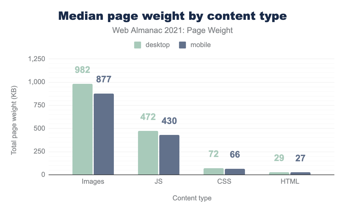
Ref: https://almanac.httparchive.org/en/2021/page-weight
Still, not all web projects give due importance to the images, and images are usually served in original or one & two predefined sizes. This approach limits the image size optimisation on various client devices based on size and resolution.
This blog will cover how we can implement dynamic image handling to help maintain high-quality images on websites and mobile applications to drive user engagement.
Setup
This solution creates a serverless architecture to initiate cost-effective image processing in the AWS Cloud. An image can be resized based on different screen sizes by adding code on your website that leverages this solution to resize the image before being sent to the screen using the image. Consider a simple scenario to serve images via an HTML or a JS framework website.
STEP 1: Lanch Cloudformation Stack
AWS has provided a managed Cloudformation template that can auto-deploy the whole solution with a few clicks. To get started, open the below link and click on the "Launch in the AWS Console" button. The page contains an overview of the solution. https://aws.amazon.com/solutions/implementations/serverless-image-handler/
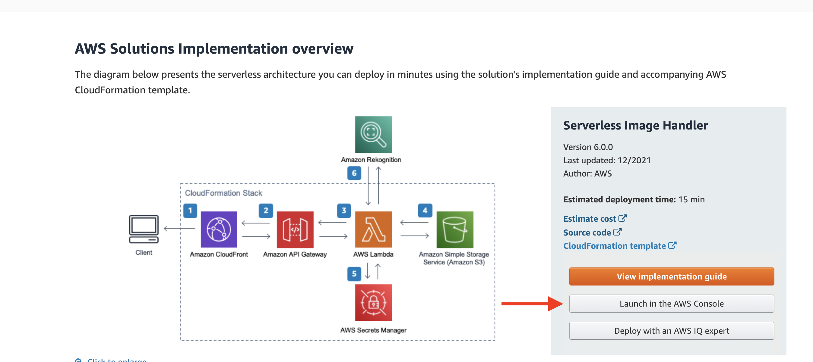
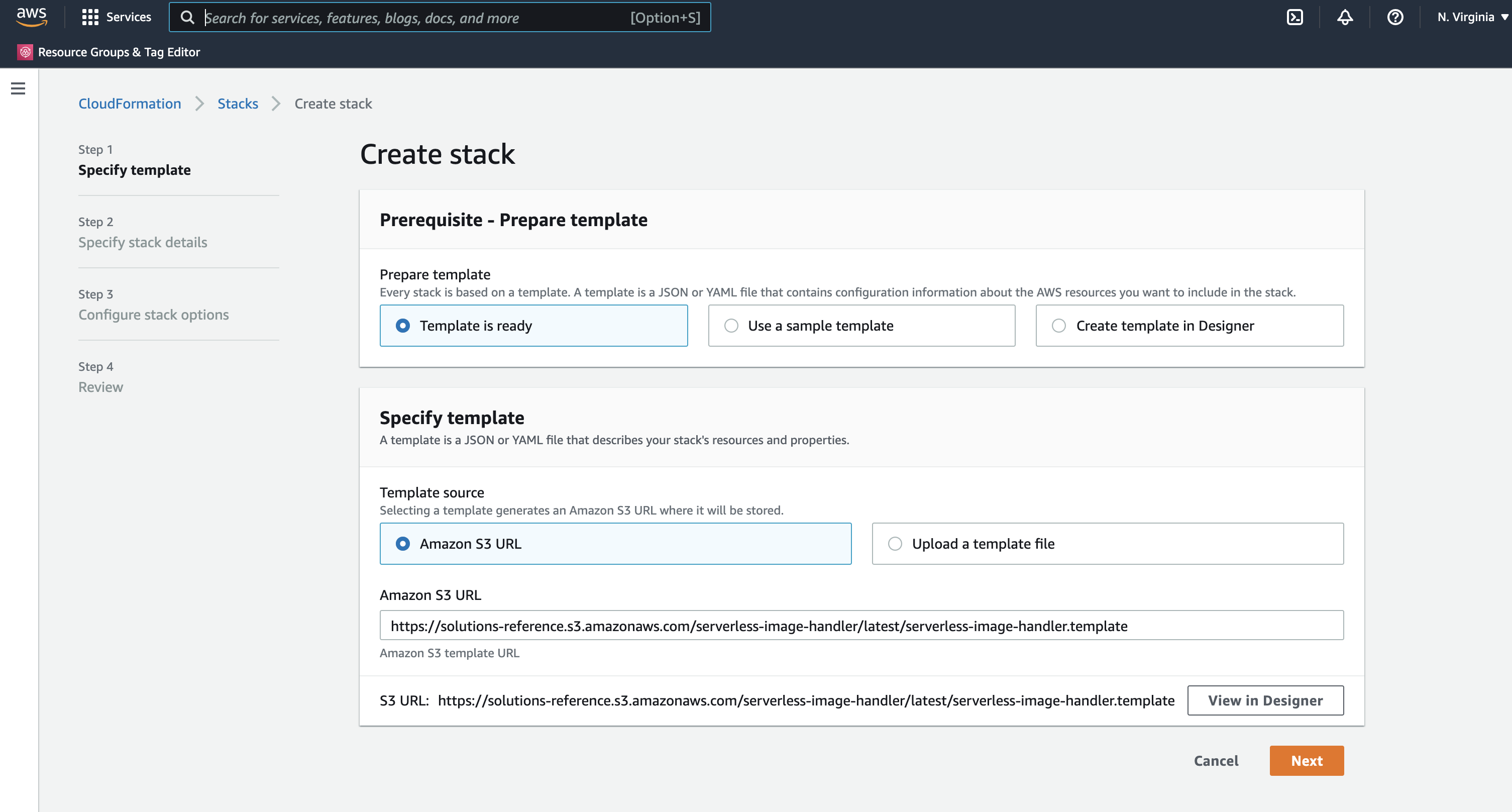
After login, the page will redirect to a CloudFormation wizard. CloudFormation is an AWS Infrastructure-as-code service that auto-deploy required AWS services. At this point, it's important to select the correct region from the top right dropdown. All the required fields should be auto-populated, so click "next".
STEP 2: Customise deployment settings
Optionally, we can change the "Stack name"; it's similar to the application name. Change "CORS Enabled" to yes and provide a "CORS Origin" domain based on the project. I've left it as a "*" wildcard for the demo to accept all domains.
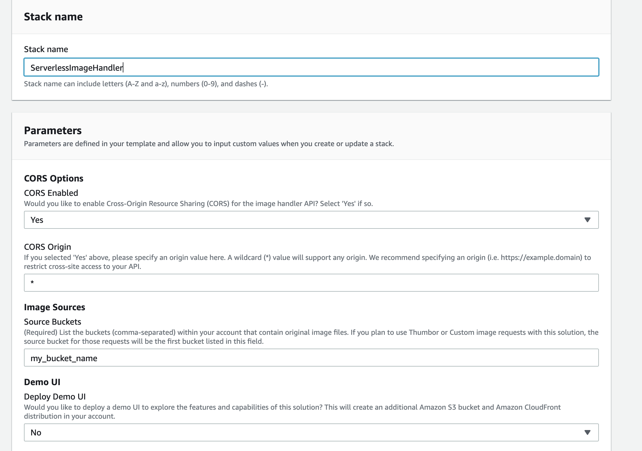
The "Source Buckets" field is important; this should point to the S3 bucket where all the source files are kept. If required, you can point to multiple S3 buckets here.
The "Demo UI" option is used to explore/test the system's capabilities. It creates a separate S3 bucket and Cloudfront URL to interact with various supported features. For production projects, select "No".
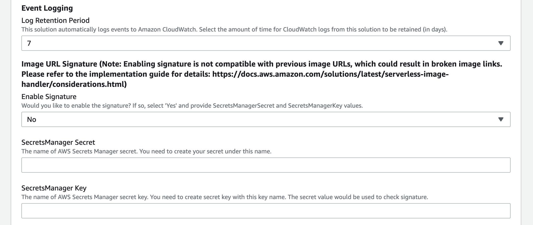
I've selected "7" to retain seven days worth of CloudWatch log. Options range from 1 to 3653 days. For "Image URL Signature", I've selected "No" as we want to serve public website images in our scenario. If "yes, " a valid "signature" string is required in the request URL like below:
https://<distributionName>.cloudfront.net/<YOUR_PATH>?signature=<YOUR_SIGNATURE>
The "SecretsManager Secret" & "SecretsManager Key" are also required for URL signatures to work.
The "Default Fallback Image" could be a generic fallback image that CloudFront will present if the requested image does not exist. It's optional, and I've left it blank for this demo.
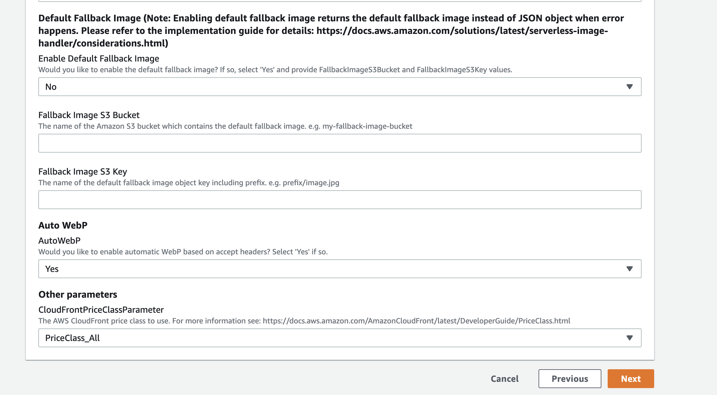
For "Auto WebP", select "Yes". If a browser indicates in advance, it will "accept" the image/webp format. In that case, the webserver knows it can safely send WebP images, greatly simplifying content negotiation and making transfer faster.
The "PriceClass" refers to the CloudFront tier. "PriceClass All" suggest that CloudFront will use all available edge locations. PriceClass 200" uses South America, New Zealand and Australia edge locations. Finally, "PriceClass 100" uses only USA, Mexico, Canada, EU & Israel based edge locations.
STEP 3: Stack Creation
Click "Next" to proceed to "Step 3". Here optionally, we can add "Tags" and provide a custom IAM role if required. Click "Next" to review and see if all the settings are correct. Tick the acknowledgement and "Create Stack". This will take a few minutes. Once complete, the status will change to "CREATE_COMPLETE". Click on the Output tab and copy the "ApiEndpoint" URL:
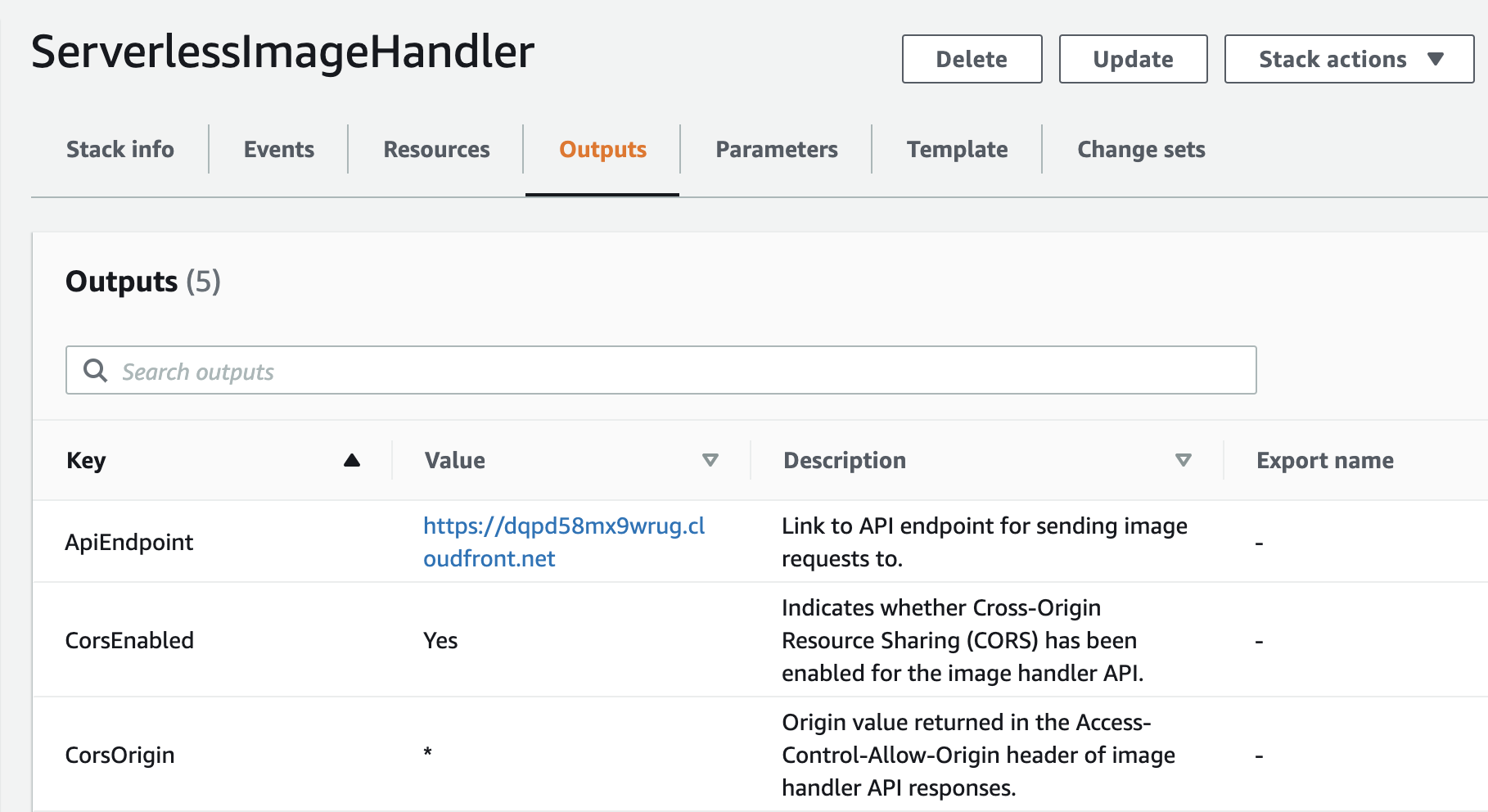
NOTE: CloudFront URLs can be configured for custom domains. Ref this for more details: https://docs.aws.amazon.com/AmazonCloudFront/latest/DeveloperGuide/CNAMEs.html
Test
To test let's append one of the image names from the source S3 bucket at the end of the Cloudfront URL for initial tests.
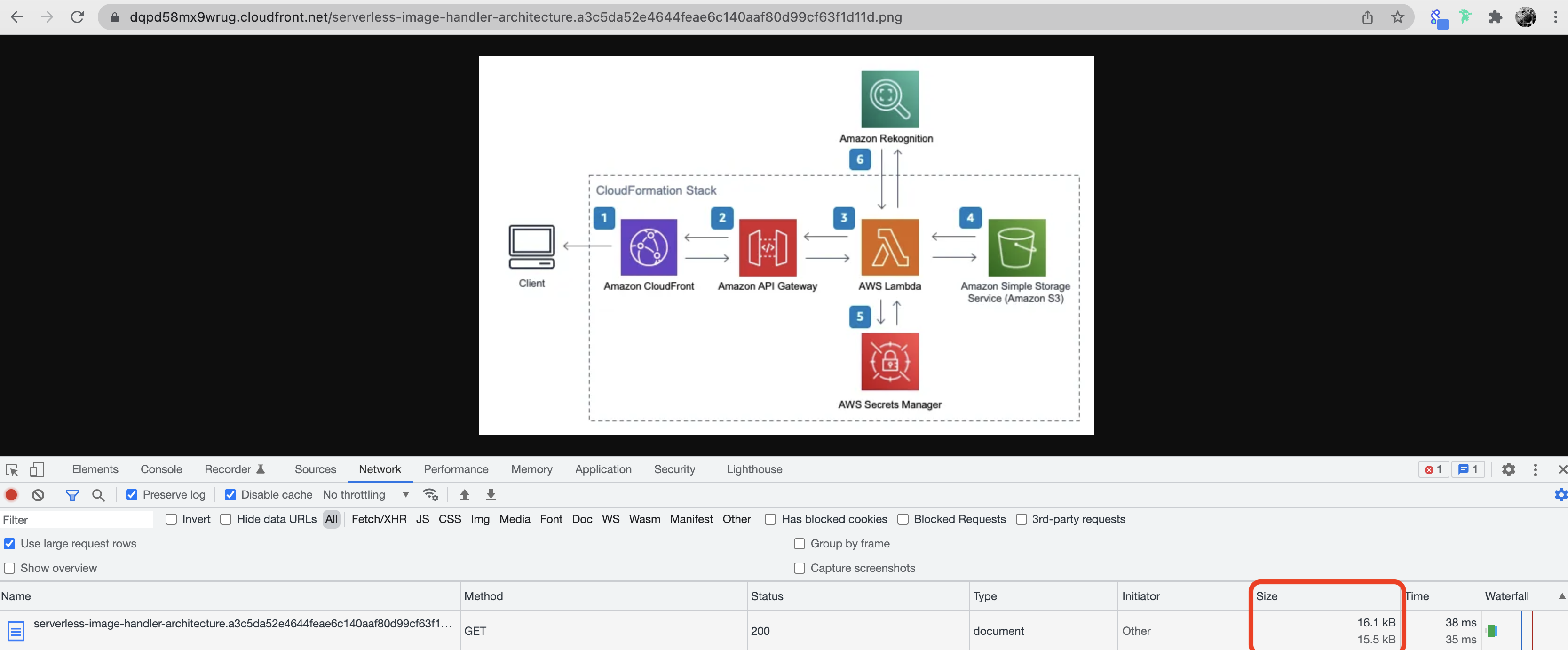
This should render the image on the browser. Let's note the image size, 16.1 kB in this instance. Now, let's compare it with a direct S3 URL serving the original image.
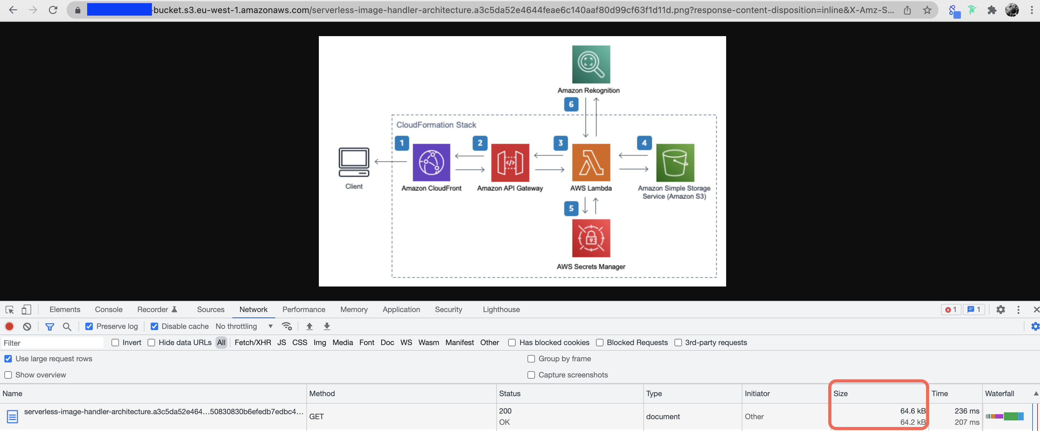
Approx 64 kB, that's roughly four times size optimisation. This result varies based on the original image composition. But it's good to know that optimisation is being done behind the scenes.
The key feature that websites can mainly benefit from is on-the-fly image resize. To achieve this, we can use the "fit-in" filter followed by the required size:
https://<yourcloudfronturl>/fit-in/300x400/<example>.jpg
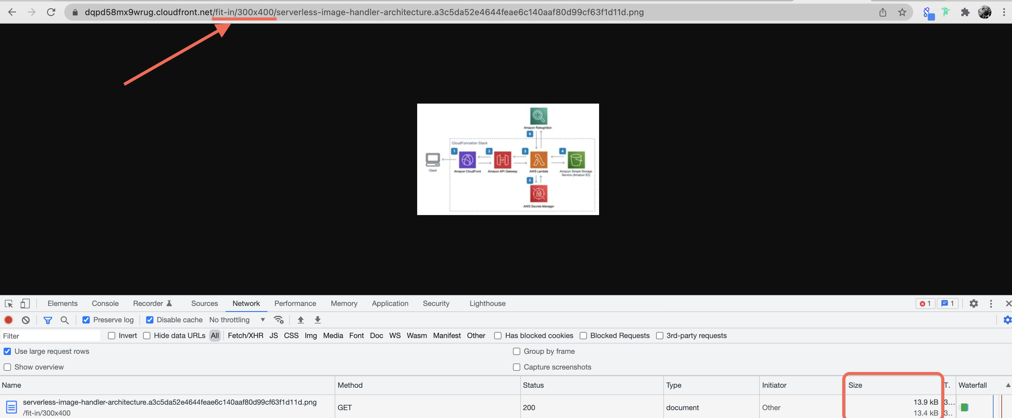
It serves the image in the required resolution and also reduces the size. This allows developers to dynamically request the correct image resolution based on device type without worrying about if that version of the file exists in the S3 bucket or not. Requests can concatenate multiple filters as well:
https://<yourcloudfronturl>/fit-in/300x400/filters:fill(00ff00)/filters:rotate(90)/<example>.jpg
Other thumbor filters like "background color", "blur", "grayscale", etc are supported as well. For the complete list, please refer to the below link: https://docs.aws.amazon.com/solutions/latest/serverless-image-handler/thumbor-filters.html
The solution uses Amazon Rekognition to perform advanced functions like smart cropping and content moderation, etc. It may not be required for a simple public website but could be useful in some cases. For full feature list please refer: https://docs.aws.amazon.com/solutions/latest/serverless-image-handler/welcome.html
I hope you found this post and Part 1 on media streaming helpful.


